A church designed to feel right at home
A church designed to feel right at home
The Project
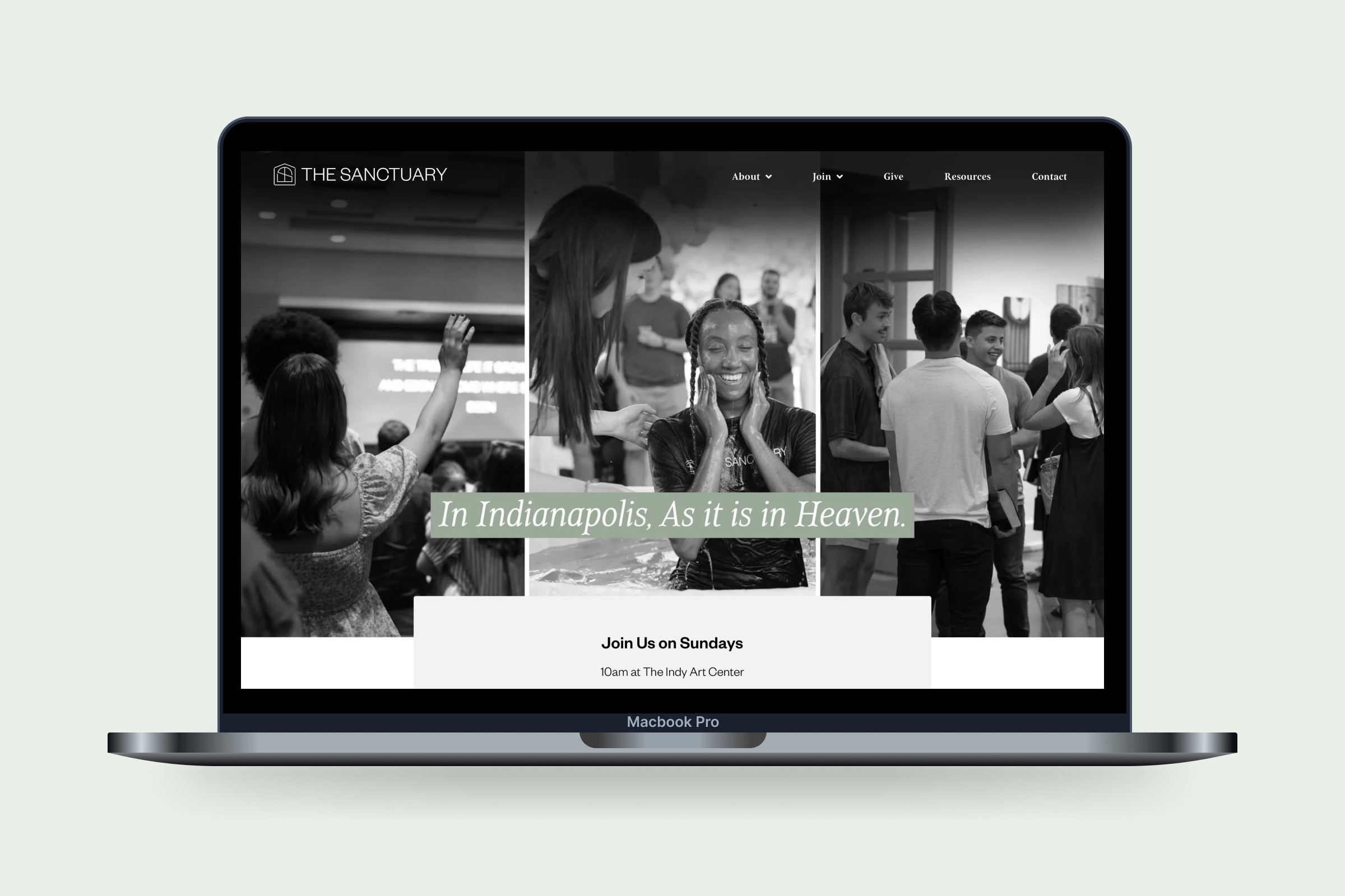
The Sanctuary is a welcoming neighborhood church. As they prepared to launch, the team brought Highmark in to develop a brand identity and website that would reflect their heart for authenticity, belonging, and transformation. We worked closely to clarify their message and express it visually, creating a grounded, hopeful brand system and a digital presence that invites people into something deeper from the very first interaction.
The Sanctuary is a welcoming neighborhood church. As they prepared to launch, the team brought Highmark in to develop a brand identity and website that would reflect their heart for authenticity, belonging, and transformation. We worked closely to clarify their message and express it visually, creating a grounded, hopeful brand system and a digital presence that invites people into something deeper from the very first interaction.
How we partnered
Logo & visual identity
Brand collateral
Website design & development
Logo & visual identity
Brand collateral
Website design & development
Brand Identity
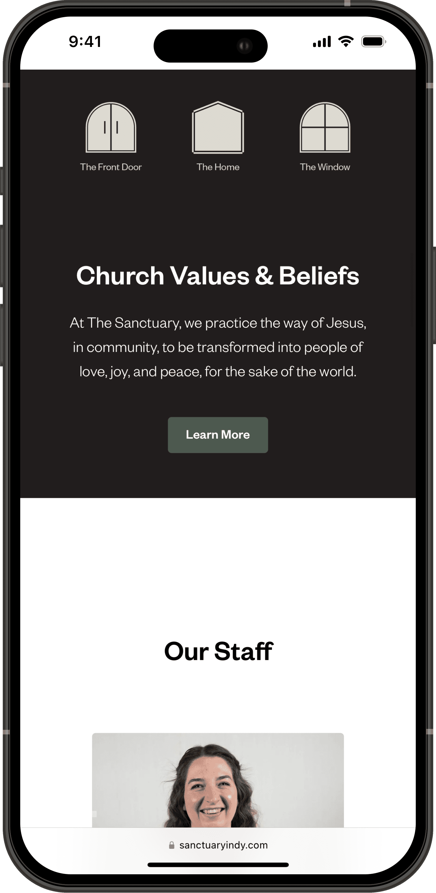
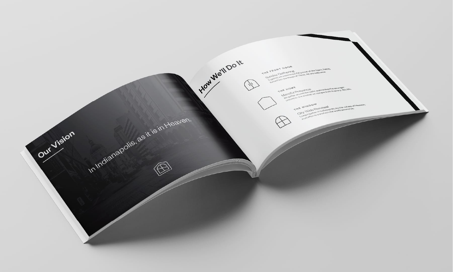
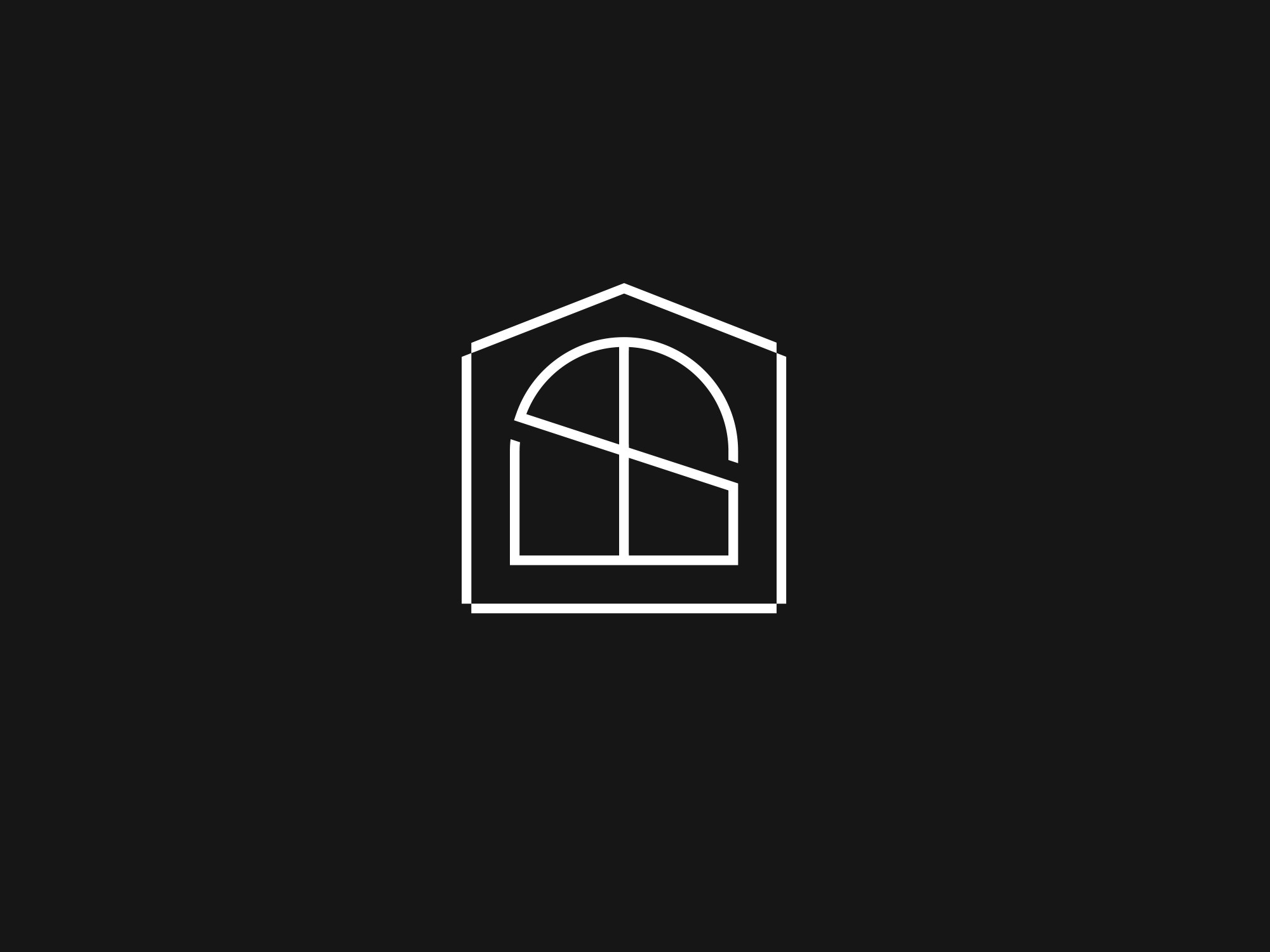
We worked closely to identify and define who the church wanted to be. From there, we crafted three visual identifiers to symbolize the brand: a front door, a window, and a home. All three combine to create the logo mark.
We worked closely to identify and define who the church wanted to be. From there, we crafted three visual identifiers to symbolize the brand: a front door, a window, and a home. All three combine to create the logo mark.

The Front Door
The welcoming entrance point

The Window
Invitation culture and transparency

The Home
A place to belong
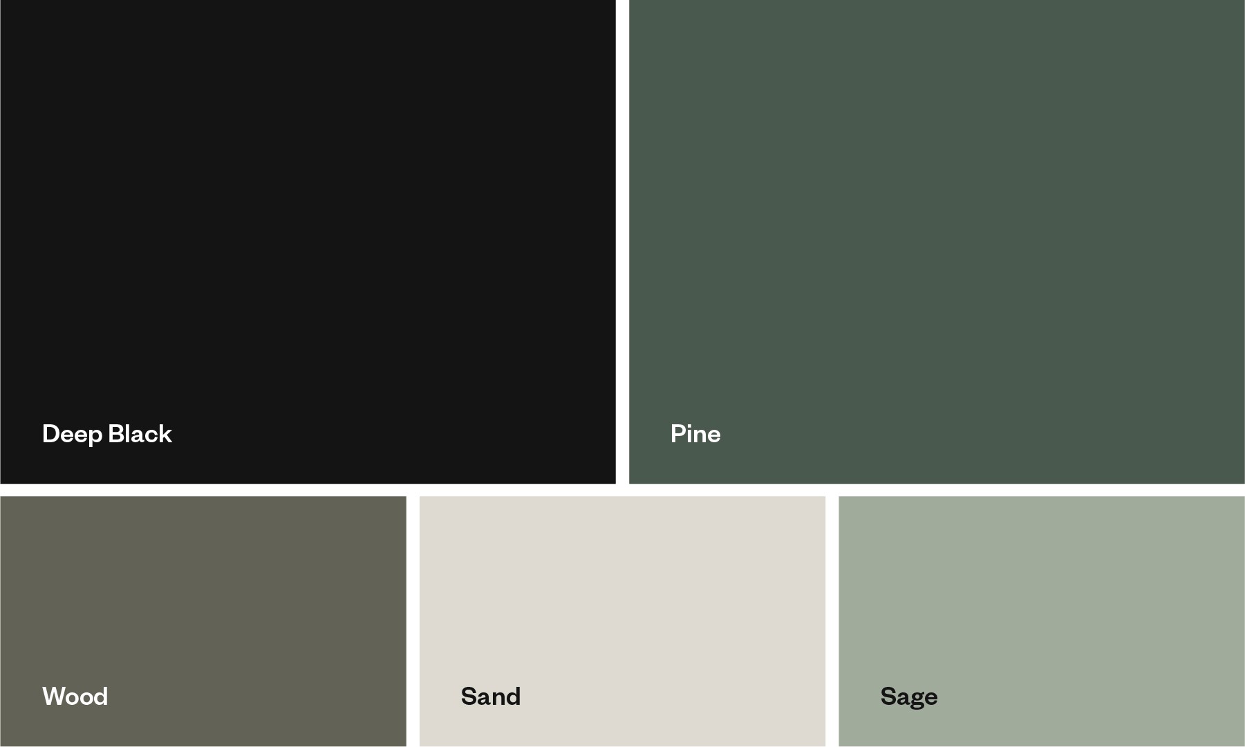
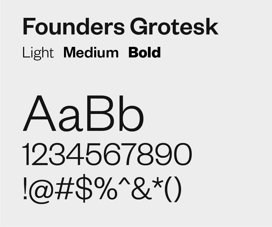
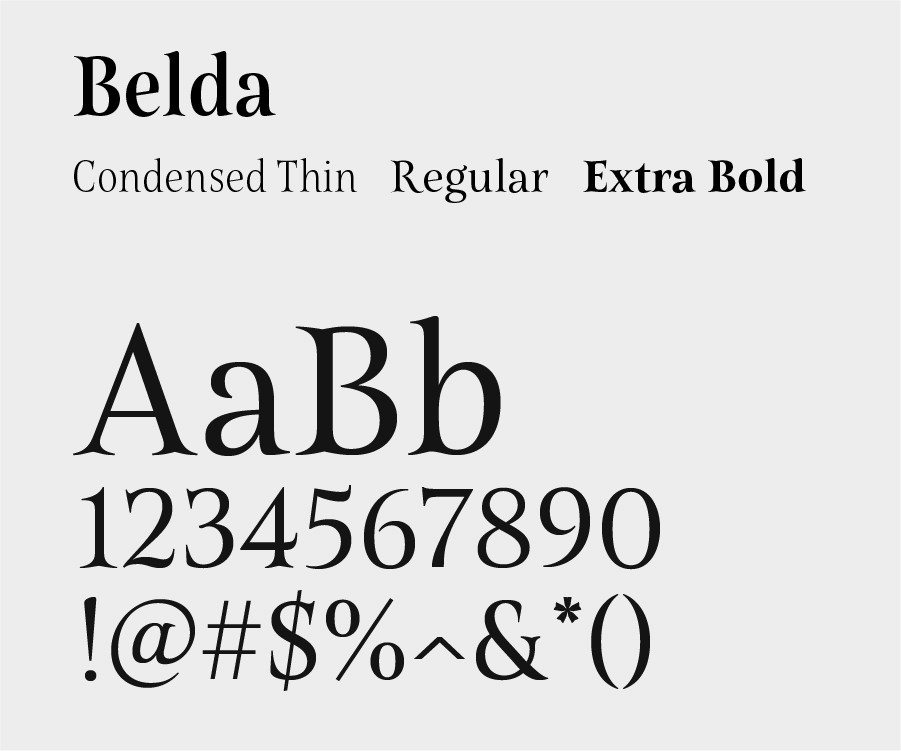
To compliment the grounded and simple approach to their ministry, neutral colors and earth tones make up the primary color palette. For type, we chose a straightforward typeface with high legibility as the primary, and a serif for the secondary.
To compliment the grounded and simple approach to their ministry, neutral colors and earth tones make up the primary color palette. For type, we chose a straightforward typeface with high legibility as the primary, and a serif for the secondary.